

Research and Evaluation Assistant Meredith Reese and Research Associate Mary McEathron, PhD, presented to a standing-room-only crowd at the American Evaluation Association (AEA)’s annual conference in October 2024. They delivered a presentation entitled “Using Qualitative Data Visualizations to Promote Use and Change.”

What is data visualization? Why is it useful in the evaluation field? And what was it about this topic that attracted such interest? Reese and McEathron explain in the following Q & A.
What is evaluation?
MM: Usually when Meredith and I talk about evaluation, we mean program evaluation. When programs are created or funded by federal, state, foundation, or other funders, these funders want to know how the programs are working. Evaluators are tasked with finding that out.
If you go to the AEA conference, though, you’ll find that evaluation includes a big swath of different roles. We met quite a few people in our field (early childhood), but we also met statisticians, economists, and environmental evaluators who work for the EPA, for example. There’s an enormous variety of professions represented at this conference.
Your session was about presenting qualitative data visually. What is qualitative data?
MR: Anything that isn’t numerical data is qualitative data. It’s information that you gather from interviews, focus groups, and open-ended responses on surveys. It can also include images, like photographs and video. A lot of times, numerical data, or quantitative data, can easily be visualized with an attractive graph. But qualitative data most often just gets reported out in text. Our session was an effort to show how we can increase engagement with and learning from qualitative data by using visualization techniques.
How do you approach visualizing qualitative data?
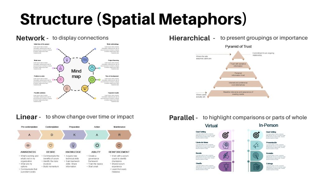
MR: Quantitative data visualization has certain practices and principles that we borrow for this type of data. First, you have to decide how you want to structure your visual, choosing among what Ryan Bell calls spatial metaphors. So, for example, let’s say you want to compare a person’s experience with coaching in person and online. A Venn diagram could be used to show what’s the same and what’s different about those two formats. Or you could depict those similarities and differences in a parallel structure where it’s a one-to-one comparison. Four spatial metaphors or structures that we highlighted in our talk were “network,” which can display connections; “hierarchical,” which can present groupings or importance; “linear,” which can show impact or change over time; and “parallel,” which can highlight comparisons or parts of a whole. [See image below.] Multiple formats may work to display the same information, but they differ in what they highlight, or draw attention to. So it’s important to be thoughtful in what you want to emphasize when selecting a format.
When you’ve determined the structure for your visualization, you want to build layers of information, so that your audience can quickly absorb the main points and go deeper where they choose. For example, bolded headings could express themes. Summary sentences or bulleted items could elaborate on those themes. In addition to layers, which go from high-level to more detailed data, we also use what we call slices–like case studies or profiles–that highlight a particular segment within the broader data set. Throughout the process, you have to guard against oversimplifying and losing the richness of qualitative data.
MM: Richness and nuance are the things that make qualitative data lengthy and dense in written form. But you want that richness and nuance! So you need to make sure you don’t lose those aspects as you try to make the data more compact and visual.
At the AEA conference, Meredith gave examples of this from our work at CEED. [See images below.] She showed how she visualized data about child care providers and the changes they made in their practice after they received coaching. She divided the information into manageable chunks and organized them around themes. This landed so nicely with our audience.
What are some of the challenges of visualizing qualitative data?
MR: The first is figuring out the crux of the themes that emerge from the data and what you want to highlight. The second is doing that without losing the complexity of the original data. There’s a tension or balance between simplifying and saying something briefly, and losing the richness and detail. You also have to be careful not to present a skewed view of the data by cutting too much out.
MM: One thing about this whole process is that it’s another level of analysis, beyond our standard data analysis. It requires you to go in and think about the data set in terms of visuals: what stays in? If I use this visualization, how does it turn out? Then you have to double check: is this visualization accurate? Should I try different formats and see what jumps out at me in each? At the end of that process, you should have an even better understanding of the data. So visualizing can be a step in the analysis.
The title of your presentation mentions that data visualization can promote use and change. Can you say more about what that means?
MM: Within the evaluation community, evaluation use and program or policy change have been a big topic of interest for quite some time. So many evaluation reports get written up and handed off to the client, they say thank you, and that’s it. The reports get shelved without anyone acting on the information in them. Evaluators want to know, “How can we get people to engage more with the results we’re presenting?”
For one thing, the amount of data that is generated through qualitative methods can be daunting to someone who just needs to get a handle on the information and use it. So handing them a big stack of paper with a lot of dense paragraphs may not be the answer. Data visualization can help the reader focus on what is most important.
MR: Using data visualizations, we really want to present qualitative data in a way that turns it into information that our clients or stakeholders can understand and act on. Breaking findings into manageable chunks through visualization makes it easier for readers to gain knowledge from the data presented. We have found that our clients really value having qualitative data represented visually and in a variety of formats. They have shared that they passed these more visual reports on to program staff, and use them in marketing, which is validating as evaluators, because we want to cultivate a culture around data-use, and making decisions informed by data.
Questions to ask when developing a visual
Reese shares the questions she relies on to guide her work when she is creating a new data visualization.
- What finding am I trying to highlight? Or what’s the most important information I’m trying to share?
- What is the simplest way to display this information?
- What structure (network, linear, hierarchical, parallel) makes sense to depict the data?
- Does this format…
- Make the information easily interpretable?
- Improve the clarity and utility of the findings?
- Match the audience’s comfort level with data?